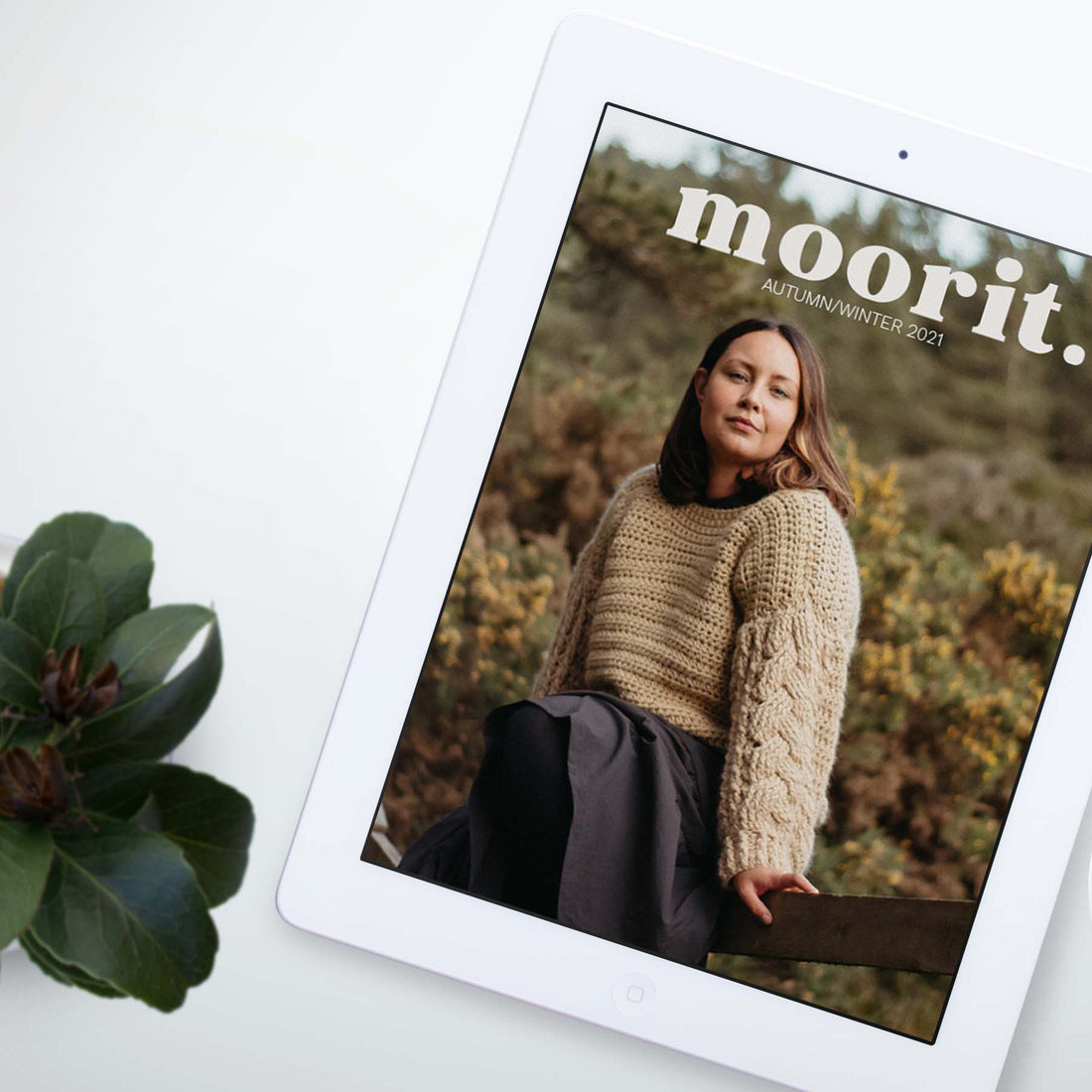
From the very beginning, Moorit had plans to build accessibility into the foundations of the publication. Luckily, we have had the pleasure of working with accessibility consultant, Renee Van Hoy to work toward this goal.
Renee has helped us develop Moorit's two Easy to Read editions: the Large Print and Read Aloud versions. Many folks may find these extra editions useful, including those with no or partial sight, people with processing disorders or dyslexia, as well as crocheters who can't follow charts.
Digital downloads include all 3 digital editions packaged together. The standard edition is a single file PDF version of the print magazine.
easy to read - large print.
The Easy to Read - Large Print edition is a multi-file large print version of the magazine. Because the large text makes the PDF very long, we have split the magazine into multiple files to make navigation easier. The main file includes the editorial pattern features and descriptions, as well as the letter from the editor and articles. Each design's pattern instructions are saved in a separate PDF with its full description. The abbreviations are also in their own file. For example, if an issue features 12 patterns, there will be 1 main PDF + 1 abbreviations files + 12 pattern files; 14 files in total.
The text in the Easy to Read edition is Arial, 24pt, all black, and with no italics. Charts are enlarged and colour optimised for colourblind users. Any instructions which rely on a chart in the print edition have been fully written out in the Large Print and Read Aloud editions.
Some instructions have been reworded or re-formatted to increase legibility. For example, this row instruction from the print edition:
Rep rows 32-33 another 15 times— 65 sts.
Has been reformatted like this for the Large Print edition:
Rows 34 - 63: Rep rows 32 and 33 another 15 times.
65 sts.
easy to read - read aloud.
The Read Aloud edition is a multi-file large print version of the magazine specially formatted and tested to be read clearly by screen reader and read aloud software.
The font style and charts are the same as the Large Print edition. The way the magazine is split into multiple files is also the same.
This edition has been tested by Renee to be read clearly by screen reader and read aloud software. To aid this, some instructions have been reworded or re-formatted. For example, this row instruction from the print edition:
Rnd 16: [2 dc, 2 dc in next st] to end— 24 sts.
Has been reformatted like this for the Read Aloud edition:
Round 16: Repeat: 2 double crochet, 2 double crochet in next stitch, to end
24 sts.
charts.
You will encounter a few different types of chart in Moorit, depending on the technique being practised. But the reality of the printed page means that sometimes the charts can be a bit on the small side.
Here is an example of a chart segment in the print and standard digital edition:

And here is the same chart in the Easy to Read editions. The chart is larger, and rather than light grey, the second colour is a distinct orange.

A lot of time and attention has gone into producing both Easy to Read editions, and we are proud to be able to offer them to our readers. As Moorit continues to grow, we expect our accessible editions will adapt and improve and evolve too. Watch this space!

